Podcast Cover Art for B2B: Design Principles That Convert
Podcast cover art is usually the first brand touchpoint a potential listener sees before they ever hear your show.
In B2B podcast marketing, this first impression matters even more. Buyers evaluate credibility, expertise, and brand quality within seconds, and your podcast cover art plays a major role in that decision.
Strong cover design is not just about aesthetics. It can support brand recognition, improve perceived authority, and make your show easier to notice across Apple Podcasts, Spotify, YouTube, LinkedIn, and email. It can affect your bottom line, too.
According to Lucidpress, consistent branding can increase revenue by up to 33%, yet 81% of companies still struggle with off-brand marketing materials.
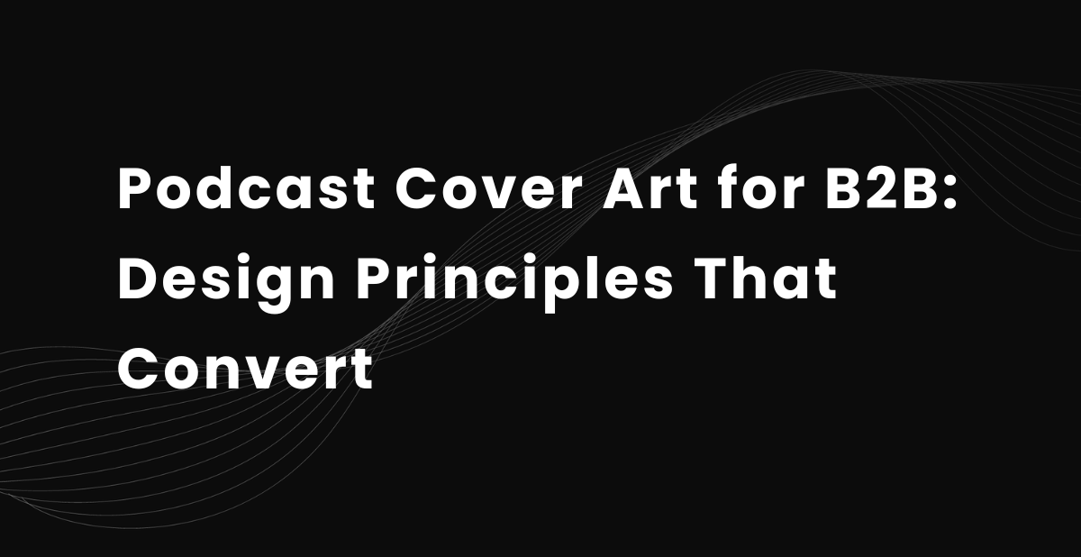
At Content Allies, we’ve seen how strong podcast cover art can shape first impressions across SaaS, consulting, and professional services shows.
Below, we’ve shared examples of podcast cover art from some of our clients’ shows.
In this guide, we’ll break down the design principles, artwork guidelines, tools, examples, and common mistakes behind high-performing B2B podcast art.
Podcast cover art vs. episode artwork
Podcast cover art and episode artwork serve different purposes, but many B2B brands confuse the two.
Podcast cover art is the primary show cover tied to your entire podcast. It appears across Apple Podcasts, Spotify, YouTube, social media profiles, and podcast directories. Its job is to establish your visual identity, communicate credibility, and make your show instantly recognizable.
Episode artwork, sometimes called episode art or chapter art, is created for individual episodes. These graphics are typically used for social media promotion, guest sharing, email marketing, and video clips.
While Podcast cover art should stay consistent to build brand recognition, episode artwork can change frequently to highlight guests, topics, quotes, or soundbites from each episode.
| Element | Podcast Cover Art | Episode Artwork |
|---|---|---|
| Main role | Represents the full show | Promotes one episode |
| Where it appears |
Podcast directories and show pages | Social, email, and guest promo |
| Design approach |
Consistent and recognizable | Flexible and episode-specific |
| Main focus | Brand identity | Guest, topic, or quote |
Why Podcast Cover Art Is Important for B2B Brands
Your podcast cover art influences whether someone notices your show in a crowded feed or scrolls past it. In B2B categories, where many shows target the same executives, operators, and decision-makers, clear artwork can help your podcast stand out beside competing options.
This matters because discovery often happens inside podcast platforms, where your cover appears next to other shows. According to The Podcast Host’s 2024 listener survey, 50% of listeners open their preferred podcast app first when searching for a new show.
This makes your cover art more than a design asset. It helps your show earn attention before the listener reads the description, checks the host, or plays an episode.
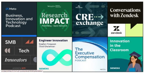
These are the main ways strong podcast cover art supports B2B podcast growth:
Brand positioning: Your cover art signals professionalism and niche focus before someone listens. The best B2B podcasts match your visual identity with your website, LinkedIn presence, logo design, and other marketing materials.
Audience qualification: Good cover design helps the right audience recognize that the show is made for them. A podcast for CFOs should look and feel different from one built for marketers, founders, engineers, or HR leaders.
Consistency across channels: Strong cover art also makes your podcast easier to recognize across social media, email, YouTube, and paid promotion. At Content Allies, we’ve seen shows improve early engagement simply by replacing outdated or unclear cover art with a cleaner, more recognizable visual identity.
Discovery and click-through: Strong podcast art improves visibility across Apple Podcasts, Spotify, YouTube, and social media. Clear typography, simple graphic design, and a consistent, recognizable color palette help your show stand out quickly.
This is a great opportunity to bring in new listeners. As Transistor notes,
“A listener's first impression of your podcast comes as they browse hundreds of podcast covers in their listening app. Your cover art should be intriguing enough for them to look at your podcast and think: ‘This looks like a podcast I should try.”
B2B podcast cover art size and platform requirements
Even the best podcast art can underperform if the formatting is wrong. Incorrect dimensions, oversized files, or poor thumbnail readability can lead to rejected uploads, blurry visuals, or inconsistent, odd display across platforms.
For B2B podcasts, cover design needs to balance branding, technical requirements, and user experience. Your podcast cover art should always use a square 1:1 format and stay readable at small sizes across Apple Podcasts, Spotify, YouTube, and RSS directories.
Apple Podcasts
Apple Podcasts has strict artwork guidelines for podcast cover art.
Here are their recommended specs:
Preferred Size: 3000 x 3000 pixels
Minimum Size: 1400 x 1400 pixels
Format: JPEG or PNG
Color Mode: RGB colorspace
File Size Limit: Under 500KB
Resolution: 72 DPI
Aspect Ratio: 1:1 square
Apple also recommends avoiding explicit content, cluttered layouts, and Apple branding elements inside the artwork.
Spotify
Spotify recommends using high-resolution cover art that looks clean on both desktop and mobile.
Recommended specs:
Size: Between 640px - 10000px wide and tall
Format: TIFF, PNG, or JPG format using lossless encoding
Aspect Ratio: 1:1 square
Image Quality: The highest-resolution photos or graphics you can find
Because many listeners browse Spotify on mobile devices, podcast cover art should stay readable at smaller sizes. Strong contrast, clear typography, and uncluttered layouts usually perform best in thumbnail view.
YouTube
As more professional podcasts expand to video, YouTube compatibility matters more than ever. For YouTube podcast show artwork, use a square image that works cleanly in playlist, channel, and mobile views.
Recommended specs:
Size: 1280 x 1280 pixels
Format: JPEG, GIF, or PNG
Aspect Ratio: 1:1 square
Color Mode: RGB
This is different from a YouTube episode thumbnail, which usually uses a 1280 x 720 pixel 16:9 format. Your podcast artwork should still be recognizable when displayed as a small playlist image or mobile thumbnail.
RSS directories
Most RSS directories follow similar podcast artwork guidelines.
The general requirements are:
Minimum Size: At least 1400 x 1400 pixels (recommended 3000x3000)
Format: JPG or PNG
Layout: Perfect square
7 design principles for high-converting B2B podcast cover art
Research shows people form visual credibility judgments almost instantly.
One study published in Behaviour & Information Technology found users assess visual appeal in as little as 50 milliseconds. Another widely cited credibility study found that 94% of first impressions were design-related rather than content-related.
For B2B podcasts, this means your cover art is shaping trust before someone listens to a single episode.
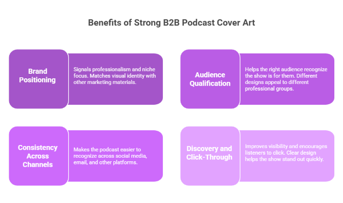
1. Prioritize clarity over creativity
Your audience should understand the podcast within 2 seconds.
If someone cannot quickly tell:
Who the podcast is for
What industry or topic does it cover
What kind of conversations or content to expect
If those signals are unclear, the design is probably too abstract or visually crowded.
Stay away from vague illustrations, overly clever concepts, or generic stock visuals. In most B2B categories, straightforward positioning performs better than complex, ambitious artwork.
2. Design for small-size readability
Most listeners first see your podcast art as a tiny thumbnail inside Apple Podcasts, Spotify, YouTube, or social media feeds.
To keep it readable, use bold fonts, strong contrast, and a short title treatment. We suggest avoiding thin typography, crowded layouts, and extra text that becomes unreadable at smaller sizes.
A good test here is to shrink the design to roughly 100 x 100 pixels. If the title becomes unreadable, you need to simplify it.
3. Create a clear visual hierarchy
Every element should not compete equally for attention. Usually, the podcast title should stand out first. The host name, brand name, or visual concept should support it rather than overpower it.
Strong podcast cover art typically has:
One main focal point
One dominant font size
One clear reading path
If everything is emphasized, nothing stands out.
4. Align with the brand without overbranding
Your podcast should feel connected to the company’s visual identity without looking like a sales deck. Use branding guidelines strategically:
This means brand colors, typography, logo design, and the right visual tone. At the same time, be wary of turning the artwork into a corporate advertisement. The best B2B podcast art feels like media first and marketing second.
5. Design for the ideal listener
A podcast for CFOs should not look like a podcast for startup founders or demand gen marketers.
Visual identity affects audience qualification more than most brands realize. Color palette, typography, imagery, and layout all signal who the content is meant for.
For example:
Enterprise audiences respond better to cleaner, restrained design
Founder-led podcasts can usually support bolder personalities and brighter colors
Technical audiences typically prefer minimal, utility-driven visuals
The best covers immediately make the right listener think: “This is relevant to me.”
6. Use faces strategically
Host photos can improve familiarity and trust, particularly for personality-driven podcasts.
Faces work best when:
The host is well-known
The podcast is interview-led
Personal brand matters to the show
Remember: not every B2B podcast needs a face-based cover design. Some enterprise and technical shows look more credible with typography-focused or concept-led artwork instead.
If you use a host photo, make sure to use professional lighting, avoid smartphone camera selfies, and keep facial expressions natural. And avoid overly aggressive poses; you don’t want to scare your listeners away.
7. Keep it simple and memorable
Most weak podcast cover art suffers from the same problem: too much happening at once.
Avoid:
Too many fonts
Excessive text
Generic microphone icons
Heavy shadows or effects
Overcomplicated backgrounds
One strong visual idea will outperform five average ones. The best podcast cover art should stay recognizable even when your listeners are quickly scrolling through crowded podcast feeds.
How to Choose the Right Podcast Cover Art Style + Examples
There is no single best podcast cover art style for B2B brands. The right approach depends on your audience, positioning, and the role the podcast plays in your marketing strategy.
Let’s explore some common cover art styles and where they belong.
1. Host-driven podcast cover art (Face-based)
Host-driven cover art works well for founder-led shows, interview podcasts, and thought leadership content where the host is central to the show’s identity.
This style is useful when the podcast relies on personal authority, executive visibility, or relationship-building. It can also work well on LinkedIn, where people-led content often feels more natural than abstract brand creative.
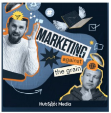
A good example is Marketing Against the Grain from HubSpot, which uses recognizable hosts and bold visual framing to make the show feel personality-driven while still connected to the brand:
The risk is quality control. Weak photography, poor lighting, awkward cropping, or overdesigned layouts can make the show feel less polished.
2. Brand-led podcast cover art (Logo-first)
Brand-led cover design is common for enterprise podcasts and company-backed shows in SaaS, finance, consulting, and professional services.
This style creates strong brand recognition and aligns naturally with existing branding guidelines and marketing materials. It can also make a newer show feel more established from the start.
The risk is looking too corporate. Many brand-first podcasts blend together because the artwork feels more like a webinar banner than a media brand. The strongest designs keep the branding clean while still creating a recognizable visual hook.
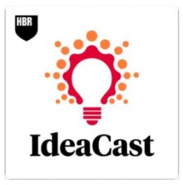
A strong example is HBR IdeaCast. The cover art is simple, professional, and brand-forward, with the Harvard Business Review identity doing much of the trust-building.
3. Conceptual or illustrative podcast cover art
Conceptual podcast art uses illustrations, symbols, or visual metaphors to communicate the topic visually.
This style works well for technical podcasts, niche industries, and category education shows where the subject matter benefits from visual explanation.
When done well, conceptual design can make a podcast feel more differentiated and memorable. But if the concept is too abstract, listeners may not immediately understand what the show is about.
A strong example is The Data Skeptic Podcast, which uses abstract, data-focused illustration and iconography to show its positioning around AI, machine learning, and data science without relying on generic podcast visuals:

4. Typography-focused podcast cover art
Typography-led podcast cover art relies primarily on text, spacing, and layout instead of photography or illustrations.
This style works best for podcasts with strong names and brands that want a clean, modern visual identity. It also scales well across Apple Podcasts, YouTube thumbnails, and social media assets because the design stays readable at small sizes.
The challenge is that minimalist design leaves very little room for mistakes. Weak typography, poor spacing, or low contrast can make the cover feel generic instead of confident.
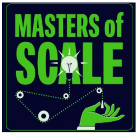
For example, check out Masters of Scale. Its cover art makes the title the dominant visual element, using large, bold typography to create instant recognition.
High-performing B2B podcast cover art examples
Looking at successful B2B podcasts makes it easier to understand what actually works in podcast cover design. The strongest examples are usually simple, recognizable, and tightly aligned with a specific audience.
1. The SaaS Podcast
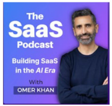
The SaaS Podcast immediately communicates who the show is for. The typography is clean, the host's presence adds familiarity, and the overall design feels focused rather than overloaded.
This is a strong example of host-driven podcast cover art that balances personality with clarity.
This style is best for:
Founder-led podcasts
Interview shows
SaaS thought leadership content
2. The McKinsey Podcast
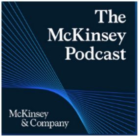
The McKinsey Podcast takes a more restrained approach. The design is minimalist, brand-led, and highly professional.
There are no unnecessary graphics or visual effects, but the brand name is unmissable. The simplicity itself reinforces authority and credibility, which fits the enterprise audience well.
If you have a recognizable name and a strong reputation, this can work well.
This is best for:
Enterprise podcasts
Consulting firms
Executive-level audiences
3. a16z Show
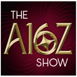
The a16z Podcast is one of the best examples of typography-focused podcast cover art. The design relies almost entirely on bold typography and high contrast.
Because the artwork is so simple, it remains recognizable across Apple Podcasts, YouTube thumbnails, LinkedIn posts, and other promotional assets.
This format is a good fit for:
Established brands
Minimalist visual identities
Podcasts with strong name recognition
4. The Data Engineering Podcast

The Data Engineering Podcast uses conceptual illustration to communicate a highly technical niche without relying on generic podcast imagery like microphones or headphones.
The artwork feels specific to the audience, which helps attract the right listeners and strengthens the show’s positioning within the data engineering space.
It’s best for:
Technical podcasts
Niche industry shows
Specialized B2B audiences
Should you work with a partner for podcast cover art?
Not every B2B podcast needs a professional design partner from day one. DIY cover art can work during the early stages if you are still testing positioning, audience fit, or content direction.
DIY may be enough when you have a limited budget, internal design support, or the podcast is not yet a major marketing channel. Tools like Canva, Figma templates, and AI-powered design tools can help create a clean, functional cover if the concept is strong.
Professional support becomes more important when the podcast is tied to brand reputation, executive visibility, enterprise buyers, or paid promotion. If your show is targeting senior decision-makers, weak design can quickly make the podcast feel less credible.
A strong partner should bring more than visual execution. Good podcast branding work should include strategic positioning, ICP alignment, design iterations, cross-channel usage, and an understanding of how podcast artwork performs across platforms.
At Content Allies, we view podcast cover art as one part of a larger podcast strategy. Strong design can help attract attention, but positioning, audience targeting, and consistent production are what drive long-term listener engagement.
One example is Tonkean’s Modern Business Operations podcast. After partnering with Content Allies on podcast strategy, branding, production, and promotion, the show became the #1 operations podcast on Apple Podcasts and helped grow Tonkean’s target audience by 174% in a single quarter. Read the full case study here.
Tools and software for creating B2B podcast cover art
The best design tool depends on your budget, design experience, and how customized the podcast artwork needs to be.
Beginner-friendly tools: Canva is a common starting point because it is fast, simple, and template-based. Adobe Express can also work well for basic branded layouts. The main risk with beginner tools is that the final design can look generic if the template is not customized enough.
Professional design tools: Adobe Illustrator is best for fully custom cover art, typography, and vector-based design. Photoshop is useful for photo-heavy podcast artwork, while Figma works well for collaborative branding workflows and fast design iterations.
AI-assisted design tools: Tools like Midjourney and DALL·E can help with early concept development, moodboards, and visual direction. However, most B2B podcast covers still need human refinement for typography, hierarchy, readability, and brand consistency.
Asset and inspiration resources: Blush.design can help with customizable illustrations, while Dribbble and Pinterest are useful for visual research. Use them for inspiration, but avoid copying trends too closely, or the artwork may feel generic.
Create B2B Podcast Cover Art that Supports Growth
At Content Allies, we help you launch and grow B2B podcasts that drive real business outcomes. Our team supports the full podcast process, including strategy, positioning, guest coordination, production, promotion, and podcast branding.
We do not treat cover design as a standalone creative task. Strong podcast art should support your broader marketing strategy, reinforce your visual identity, improve discoverability across Apple Podcasts and YouTube, and attract the right audience from the start.
Whether you are launching a new show or refreshing an existing one, we can help you create podcast branding for long-term growth.
Contact us to learn more about how we can help you.
FAQs
What size should podcast cover art be?
Apple Podcasts recommends podcast cover art at 3000 x 3000 pixels (minimum 1400 x 1400) in JPG or PNG format, while Spotify supports square artwork between 640px and 10000px, YouTube recommends 1280 x 1280 pixel square artwork, and most RSS directories require at least 1400 x 1400 pixel JPG or PNG images in a perfect 1:1 square format.
What makes a good B2B podcast cover art?
The best B2B podcast cover art clearly communicates the audience and topic within 1-2 seconds using readable typography, strong contrast, and a focused visual identity that still works at thumbnail size.
How much text should the podcast cover art include?
Most high-performing B2B podcast covers use fewer than 6-8 total words because long titles, taglines, and extra descriptors become unreadable inside Apple Podcasts and Spotify search results.
Should I include my logo in podcast cover art?
You should include your logo only if it strengthens brand recognition without overpowering the cover design, since oversized logos often make podcasts look more like corporate webinars than media brands.
How does Content Allies approach podcast cover art differently?
At Content Allies, we approach podcast cover art as part of a larger growth strategy by combining audience positioning, branding, thumbnail optimization, and cross-channel promotion instead of treating design as an isolated creative task.
Appendix
- PR Newswire — Study Finds Companies with Consistent Branding Can See Up to 33% Increase in Revenue
- The Podcast Host — Podcast Discovery Statistics 2024
- Apple Podcasts — Artwork Guide
- Spotify for Creators — Show Art Dos and Don'ts
- RSS.com — Episode Art Formatting Requirements
- Taylor & Francis Online — Research on First Impressions and Visual Design
- CXL — First Impressions Matter: The Importance of Great Visual Design